Learn some do’s and don’ts by watching these video clips and following the observations of Tom Mucciolo as he plays the role of The VISUAL CRITIC™.
On this page you will see PUBLIC performances, linked to content posted on YouTube or YouTube-like sites that host the original video content.
From a copyright perspective, the intent of these reviews is for educational purposes only. There is no recommendation, implied endorsement or promotion of the artists, speakers, or presenters.
Some of the clips are narrated observations, while other clips are referenced and reviewed in a frame-based visual analysis.
Choose from the following clips:
-
Observing Body Language – Charlie Rose Interview – Bill Gates
-
2016-First Presidential Debate Analysis – Donald Trump vs. Hillary Clinton
-
2012-First Presidential Debate Analysis – Mitt Romney vs. Barack Obama
-
2012-Second Presidential Debate Analysis – Mitt Romney vs. Barack Obama
-
2012-Third Presidential Debate Analysis – Mitt Romney vs. Barack Obama
-
National Car Rental – TV Commercial – Poor Presentation Skills
Observing Body Language (narrated by Tom Mucciolo)
Bill Gates is interviewed by Charlie Rose. Excerpts from the segment are analyzed from a body language perspective. Challenges and opportunities are discussed related to Conversational-izing, Virtual Space and Timelines.
2016-Presidential Debate Analysis (narrated by Tom Mucciolo)
The first Presidential debate of 2016 between Donald Trump and Hillary Clinton, reviewed from a Non-Verbal perspective with a focus with a focus on body language, eye contact, hand gestures, viewing angles and more.
Presidential Debate Analysis (narrated by Tom Mucciolo)
The first Presidential debate of 2012 between Republican candidate Mitt Romney and President Barack Obama reviewed from a Non-Verbal perspective with a focus on body language, gestures and eye contact.
Presidential Debate Analysis (narrated by Tom Mucciolo)
The second Presidential debate of 2012 between Republican candidate Mitt Romney and President Barack Obama reviewed from a Non-Verbal perspective with a focus on body language, eye contact, hand gestures, proximity, navigation, confrontation and speaking style.
Presidential Debate Analysis (narrated by Tom Mucciolo)
The third Presidential debate of 2012 between Republican candidate Mitt Romney and President Barack Obama reviewed from a Non-Verbal perspective with a focus on upper body actions, visibility of gestures, hand positions, eye contact, confrontation and speaking style.
When a TV Ad Goes Wrong – National Car Rental
 A television commercial touting the business skills of a rising young executive only serves to make her look less than professional.
First aired during the 2010 Super Bowl, National Car Rental sends the wrong corporate message to would-be presenters in a corporate world.
The 30-second ad is shown below, but the first 10 seconds tell the whole story.
After watching the video, we thought that a few still-images would clearly demonstrate the many mistakes that plague the poor presenter, commercially named Robin. The voice-over narrator uses the proverbial “you” to connect the viewer to Robin’s presentation with directed phrases like “you are a business pro…” But, it takes less than 10 seconds to watch her fade from “pro” to amateur.
“Robin” the Spotlight
The commercial opens in a conference room with Robin standing directly in front of the screen. The lesson learned is that the image should never appear on your body, as the content will look distorted and difficult to decipher.

Figure 1 – Hands clasped together, standing in front of the screen.
In Figure 1, the problems mount as her body language suggests hesitancy and possible nervousness when the hands clasp together.
Usually, if a presenter is unsure of content, the hands tend to cover the more vulnerable parts of the body as a form of protection.
This action is one of the biggest mistakes made by speakers who are trying to project confidence, but imply the opposite with hands held together.
Of course, standing in the light source only draws more attention to the problem.
Visual Design is not a Piece of Cake Pie

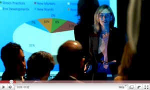
Figure 2 – One slice too many – and it’s missing!
The background image indicates a lack of attention to visual design. With a pie chart, the eye scans the slices starting from the 12 o’clock position. In Figure 2, the starting point is a slice of 0%. How can you have 0% of something? Imagine offering a guest a slice of nothing!
While the labels (percentages) are shown inside each slice, the floating “0%” sits outside of the pie, because even PowerPoint can’t display a pie slice that doesn’t really exist.
In fact, the legend above the pie accounts for only 6 pie segments, ignoring the 0%. Imagine if someone asked for the backup data to support the missing slice?
There are other visual contrast issues. When labels are placed inside pie segments, text color may lose contrast, such as the dark text inside the darkest slice. Due to variations in data segment size and color, it is better to place labels on the outside so that font size and color can remain consistent.
The eye also navigates to the brightest foreground elements. So, for the pie chart, it is better to position the brighter color segments nearest the 12 o’clock position. But this is not done here. Moreover, although the two largest slices are brightest, they are also nearly identical in color. Compare the 35% slice in Figure 2 (above) with the 29% slice in Figure 3 (below) along with the related squares in the legend. The similarity in colors is visually confusing.
In general, the slide background color is too light, forcing the heading (Figure 1) to be darker. A white or bright background suggests a print metaphor, but slides should follow visual design rules, using darker backgrounds with lighter foreground elements. Although the attempt is made to offset the chart area in a slightly darker color, it is still too light because the legend above the pie uses darker text.
A Negative Point of View

Figure 3 – When finger point meets PowerPoint.
The narrator gives Robin the title “princess of the PowerPoint” but perhaps “flaunter of the fingerpoint” is more accurate. Figure 3 captures one of the worst gestures a speaker can make — the pointed finger.
The gesture is also mirrored in shadow and appears accusatory. If you point a finger at someone, three fingers always point back at you.
Always use an open palm to appear warm, inviting, and approachable.
The distracting delivery is compounded by her stepping into the light source, which visually splits her in two, reminiscent of a partial eclipse. How is it that the director did not see this?
Left is Right
During the entire presentation, Robin is standing opposite of the reading anchor. English has left-to-right pattern, so she should be positioned on the LEFT side of the screen, from an audience perspective. When a presenter is positioned on the same side as the reading anchor, the audience makes faster connections to content.

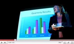
Figure 4 – The wrong side of the argument.
In Figure 4, she is opposite the reading anchor, partially in the light source, creating a poor line-of-sight. For those seated on her side, she blocks the view of the most current data (4th Quarter) as well as any corresponding legend that explains the bar colors.
These items are distorted when projected on her face and clothes.
Examining the slide content, clusters of bars should follow a darker-to-lighter pattern, from left-to-right.
However, by placing the brightest bar in the middle of each cluster, the eye is drawn inward to each data set, rather than across the clusters intentionally placed along a quarterly timeline. In fact, the phrase “Quarterly Results” is not an emphatic heading and does little to guide the eye to specific data.
Reading Body Language

Figure 5 – Not the way to read facial expressions.
One of the most distracting moments in a presentation is when a speaker stands directly in front of the projector, as words appear across the person’s face.
Keep in mind that when penetrating the light source you may become a walking billboard.
Figure 5 shows Robin looking completely unprofessional, wearing a less than visually appealing PowerPoint tattoo created from the legend labels that float across her forehead, nose and cheeks.
It is clear that neither a “business pro” nor a “princess of the PowerPoint” was present during the filming of this commercial.
Apparently, the ad agency responsible for the commercial failed to consult with anyone who knows how to present; or, worse yet, the agency may believe this is the norm in a business meeting. One can only imagine how the agency pitches their clients.
Of course, the fact that this was aired during the Super Bowl (and continues to run) shows that National Car Rental thinks it’s acceptable to the widest possible audience, nearly everyone on the planet. So, both the client and the agency are cast in the same poor light and, unfortunately, this really projects a poor image (pun intended).
It is disappointing that a large business entity promotes such a visually distracting environment while attempting to market services to the very business clientele they insult.
Hopefully, National Car Rental and its ad agency will consult with business professionals before making a commercial for business professionals!
